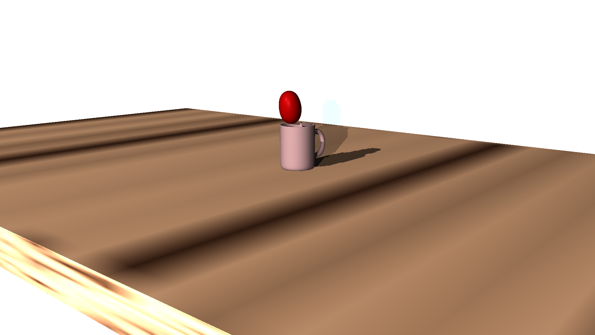
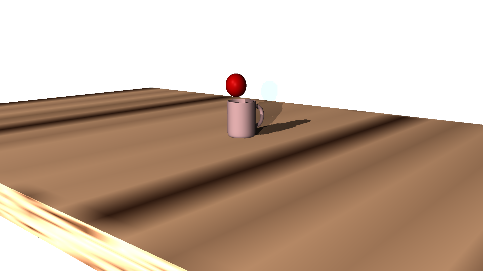
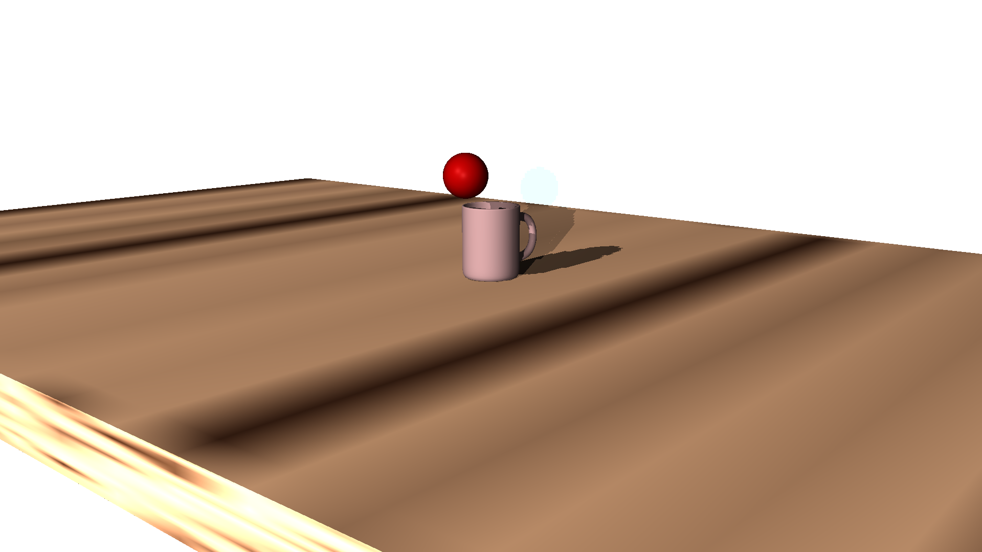
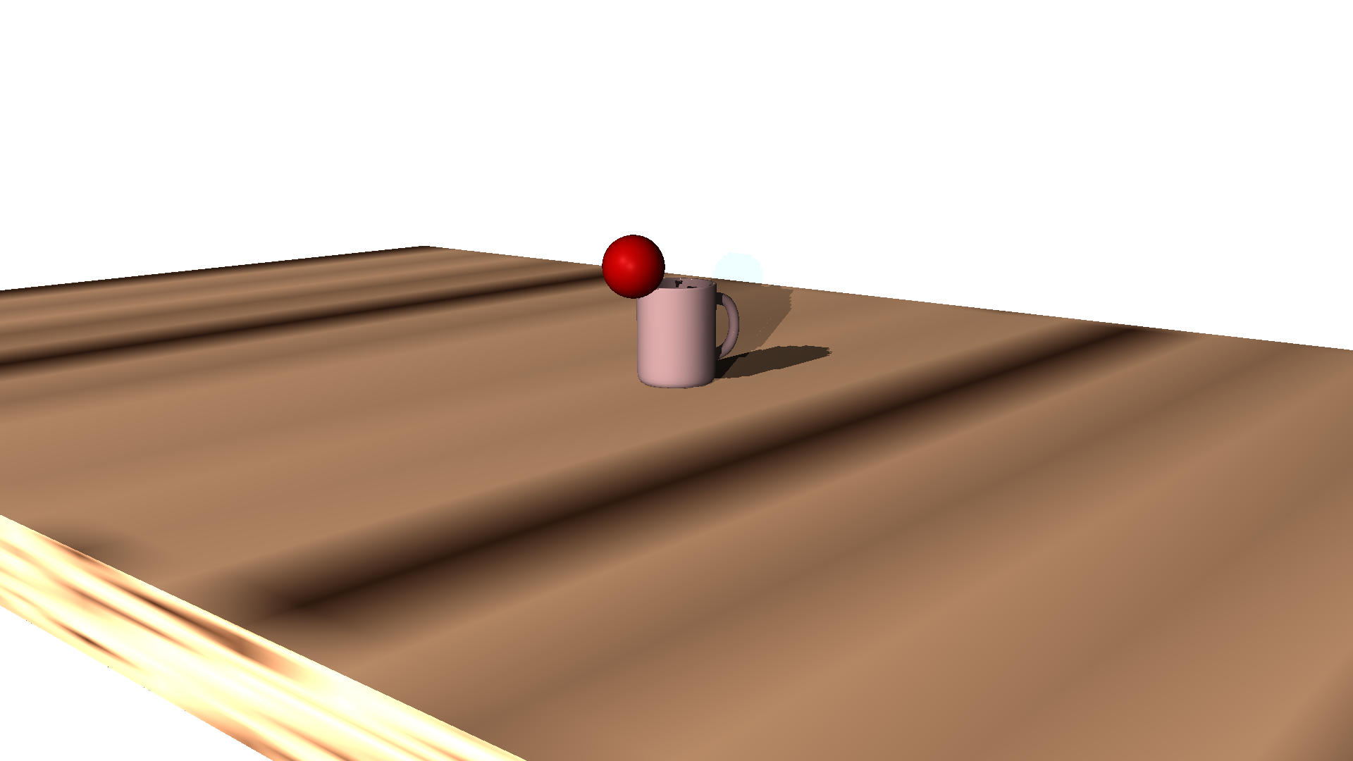
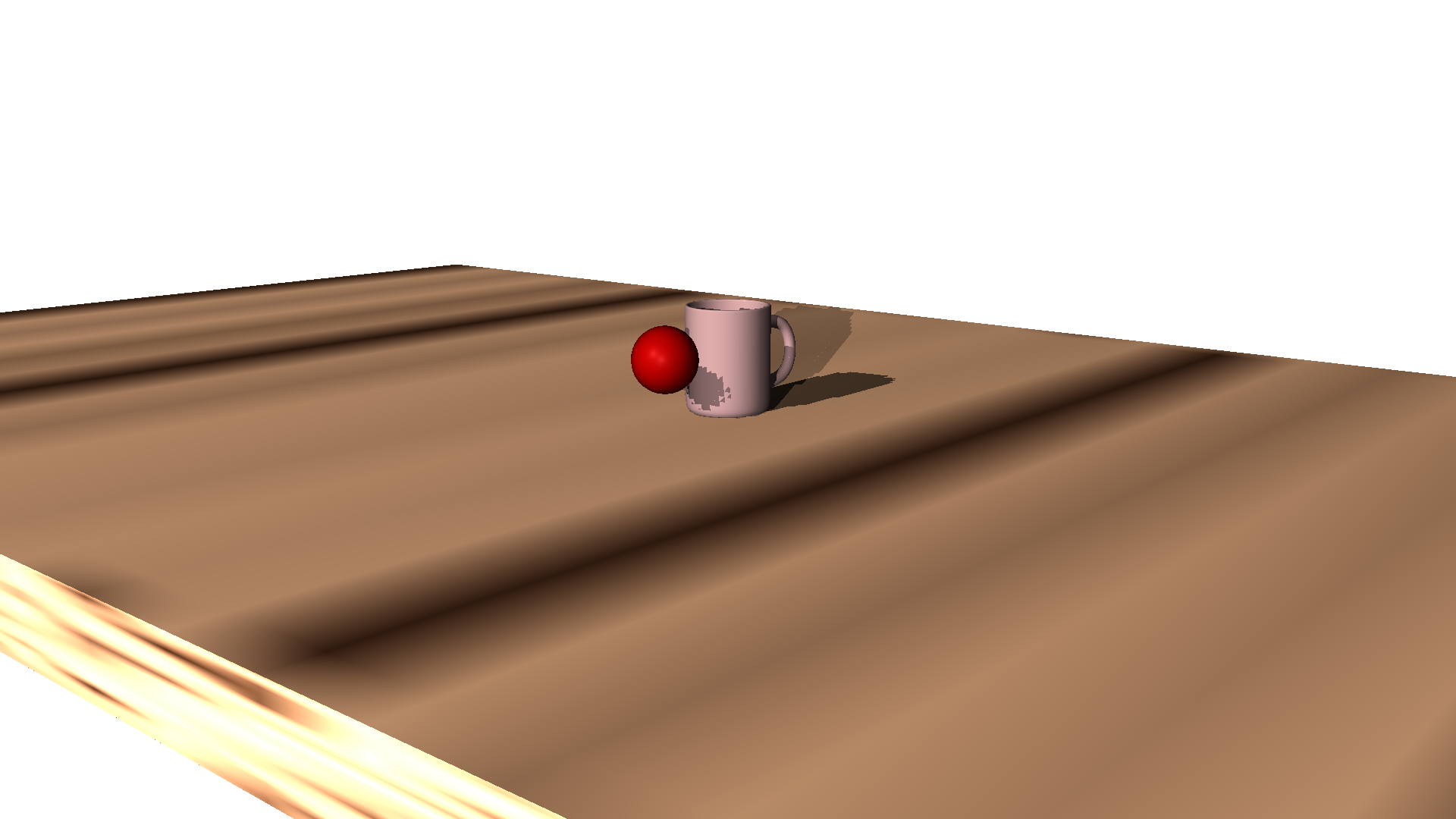
Believe it or not, while most of the ball bouncing was done from pose-to-pose, I actually found it easier to animate the part where the ball bounces out of the cup using the "straight ahead" technique.
It does look a little bit weird, but it's fine, and I like it.
Staging:
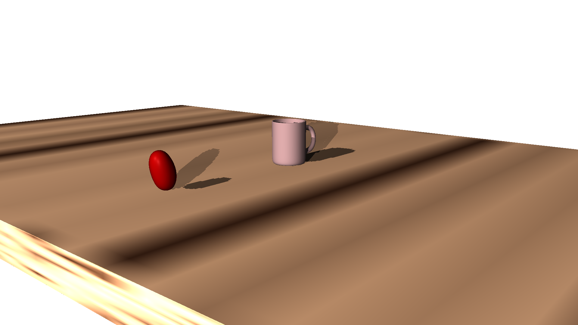
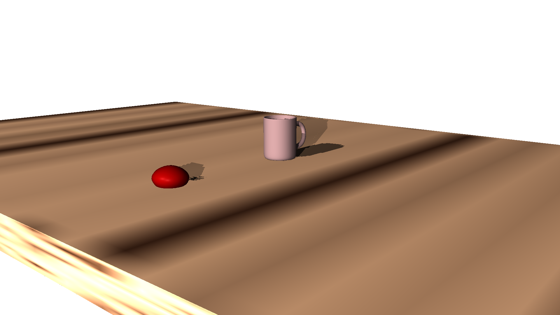
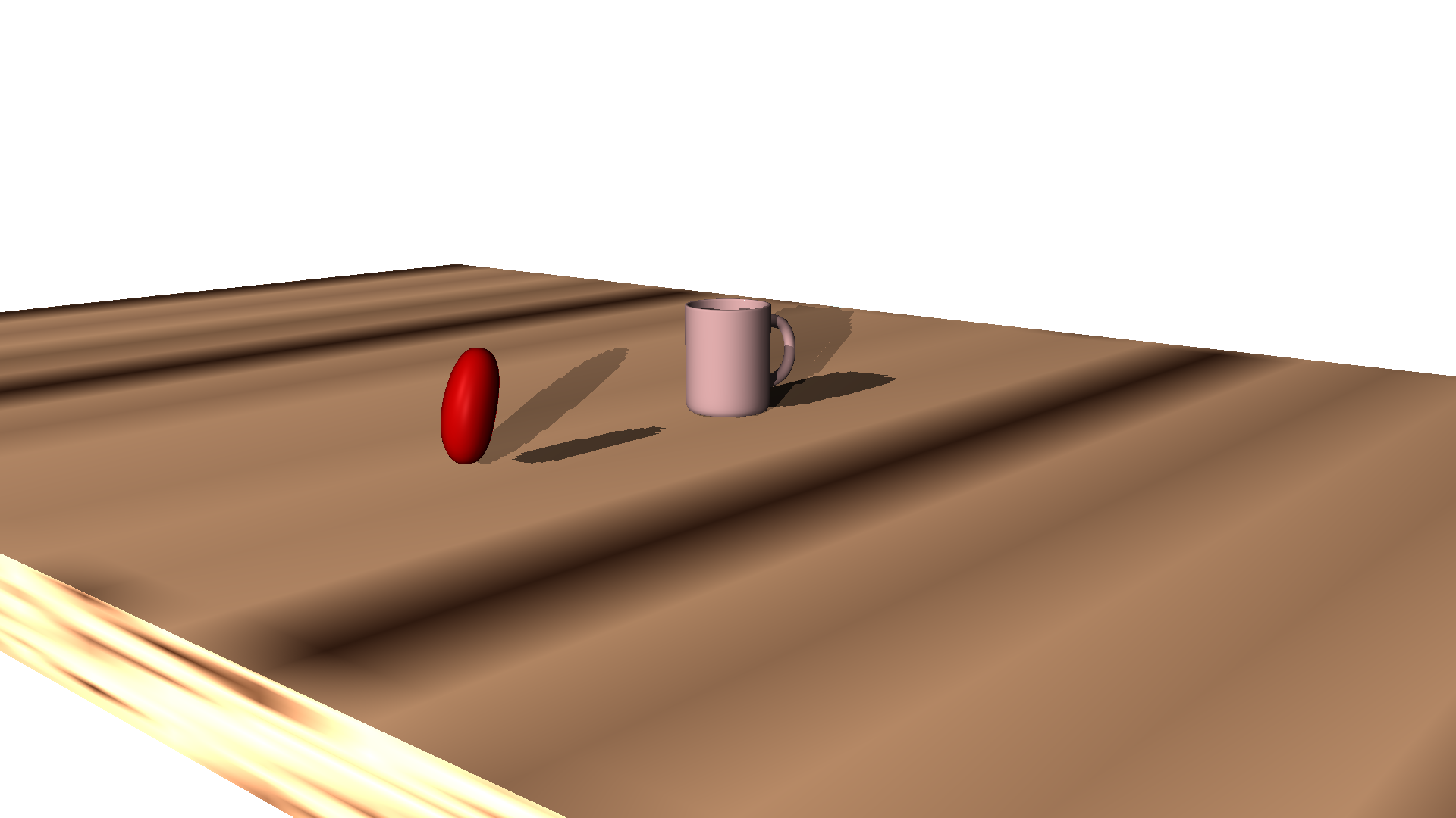
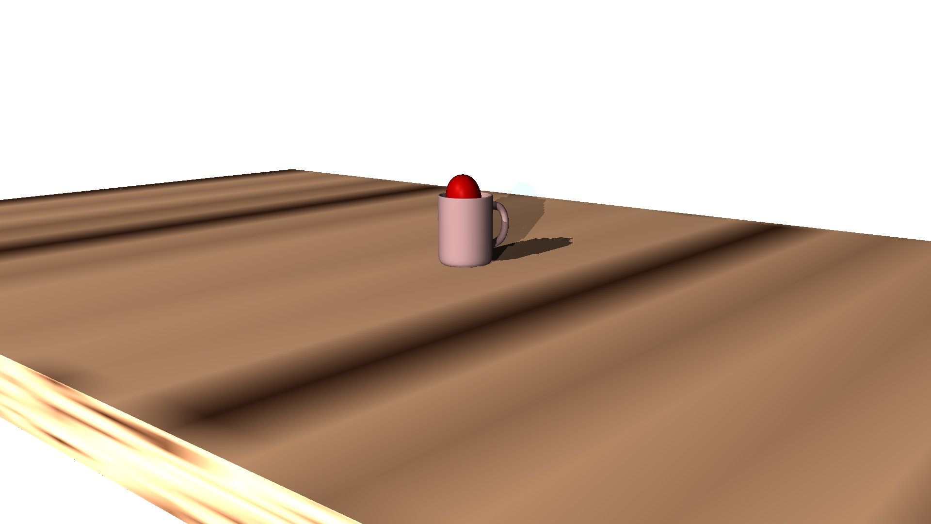
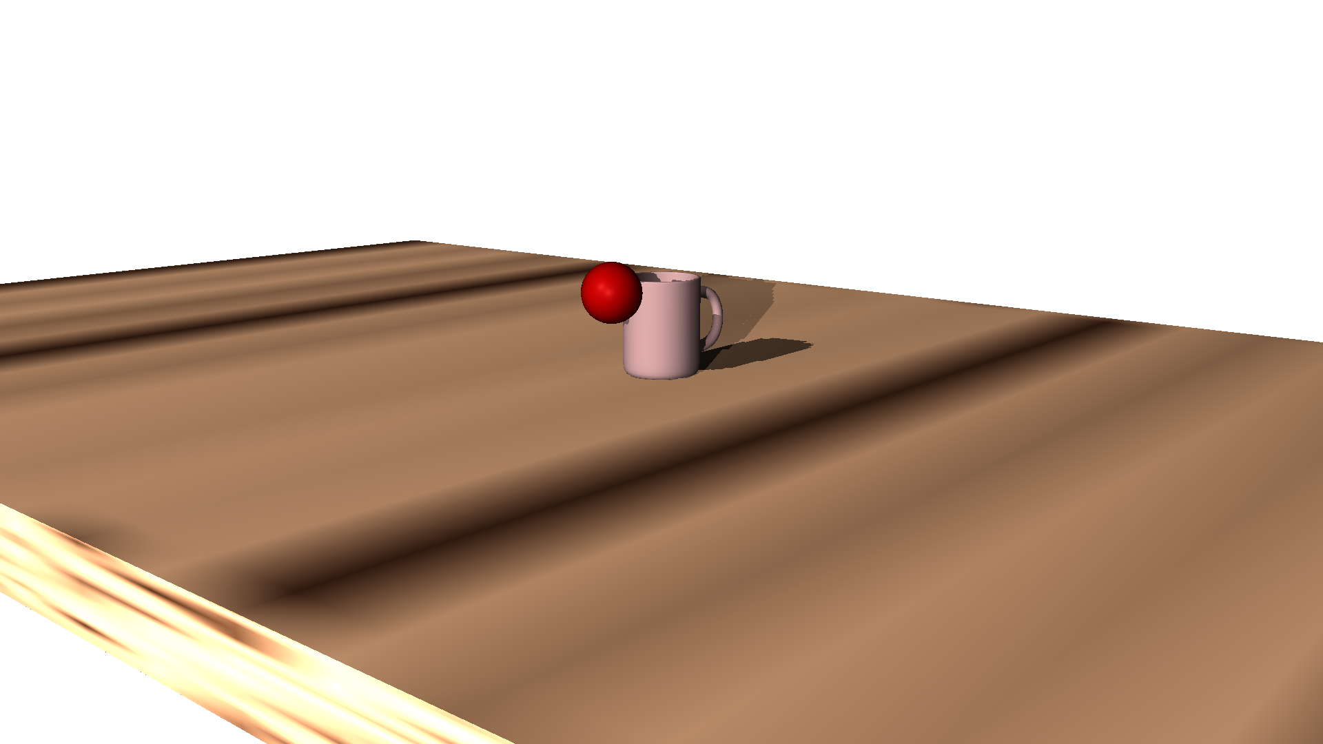
Viewer looks at the center of the screen while waiting for an action (since there's a thing there), then a ball is thrown from the left to that center. Ideally you know where the ball is supposed to land before it lands just because of how the scene is staged.
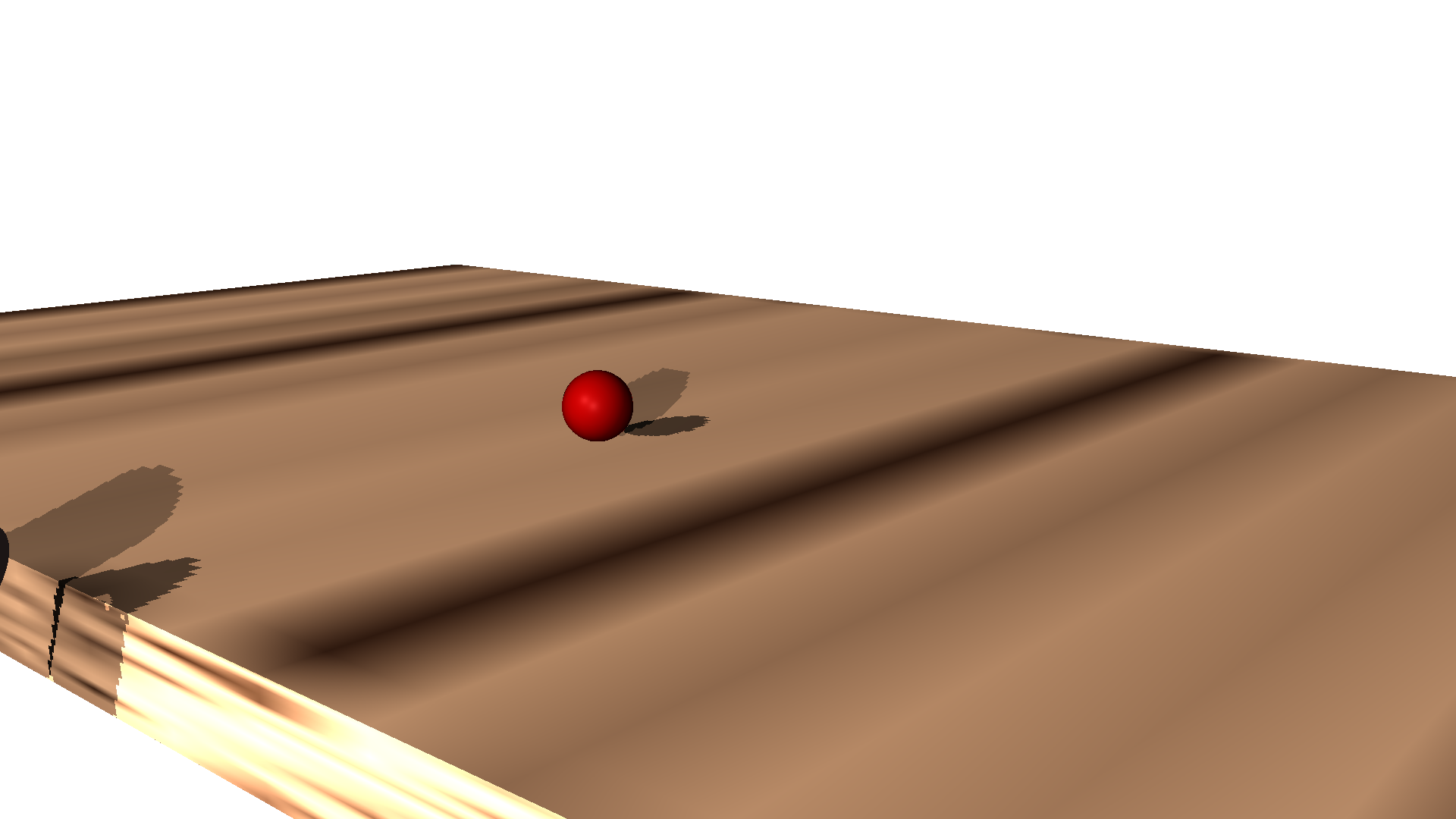
This is why the ball stays on the table during the second shot:
Timing is also an important factor for the mood and tone the animation takes. I'm not sure how to take pictures of that, but it was on my mind while I was making the animation.
Unfortunately, I ended up waking up today disagreeing with a lot of the decisions I made. It felt right while I was doing it, but I guess viewing the same thing over and over again desensitized me to how it actually felt. The second shot should take less time to throw, while the third shot should take longer to throw.
Storyboard
No storyboard yet.
I wanted to base this off of those compilations of trick shots you might see on social media,
where the camera angle stays the same, and the person edits together multiple shots that get
closer and closer to making the cool trick shot.
The original idea I had didn't actually make the shot at the end, though. I wanted to build up
anticipation for a long time on the final shot in order to make it more suspenseful, then have the ball
bounce out of the cup like you see the first shot do, and then the actual final shot is them throwing the
cup at the table.
I didn't actually have the time to make the first couple of missed shots though, so instead you have the
unplanned for happy ending that I did on a whim (because otherwise I felt that the story was lacking)
Now there's tension (the first shot), a climax (the second shot), and a resolution (the final shot).
The storytelling is still a bit lacking, though. I think the animation timings might be a bit off.
Credits
I followed this YouTube Tutorial in order to model the coffee cup.
Everything else is my own, for better or for worse (including creating the wood texture in the hypershader, which is why it looks bad).
Other
The wall is too white. It looks like a pure white background instead of a wall. Why. (I probably have too many lights set up)